Photo Booth Props for Weddings: What to Provide and What to Skip
If you’re planning a wedding, you already know the vibe you don’t want.
You don’t want your photo booth gallery to look like a kid’s birthday party. You don’t want flimsy props that break halfway through cocktail hour. And you definitely don’t want a table full of random stuff that clashes with your florals, signage, and overall aesthetic.
You want photos that look elevated and guests who actually have fun.
This guide gives you a simple, simple prop plan: what to include, what to skip, and how to keep your photo booth feeling luxury (without sucking the personality out of it).
The goal: props that add personality without ruining the photos
The best wedding photo booth props do three things:
They photograph well (clean shapes, flattering colors, no visual chaos)
They match your wedding style (or at least don’t fight it)
They’re easy to grab and use fast (less confusion = shorter lines)
If you nail those three, your booth stays classy and your guests stay engaged.
The “classy prop mix” (the easiest way to get it right)
If you want a simple formula, use this:
70% elevated basics (timeless, neutral, always flattering)
20% playful-but-still-pretty (a little sass, but not tacky)
10% personal to you (inside jokes, your story, your city)
That mix keeps the booth fun without turning it into a costume party.
What to provide: classy wedding photo booth props that actually work
1) Minimal word signs (clean fonts, short phrases)
Word signs are popular for a reason: they’re easy, they read clearly in photos, and they don’t cover anyone’s face.
Look for phrases that feel modern and simple, like:
“Just Married”
“Cheers”
“The Party”
“Forever”
“Hitched”
Some booths lean into slightly sassier phrases too (still in clean fonts and neutral finishes). The key is keeping it designed, not dollar-store.
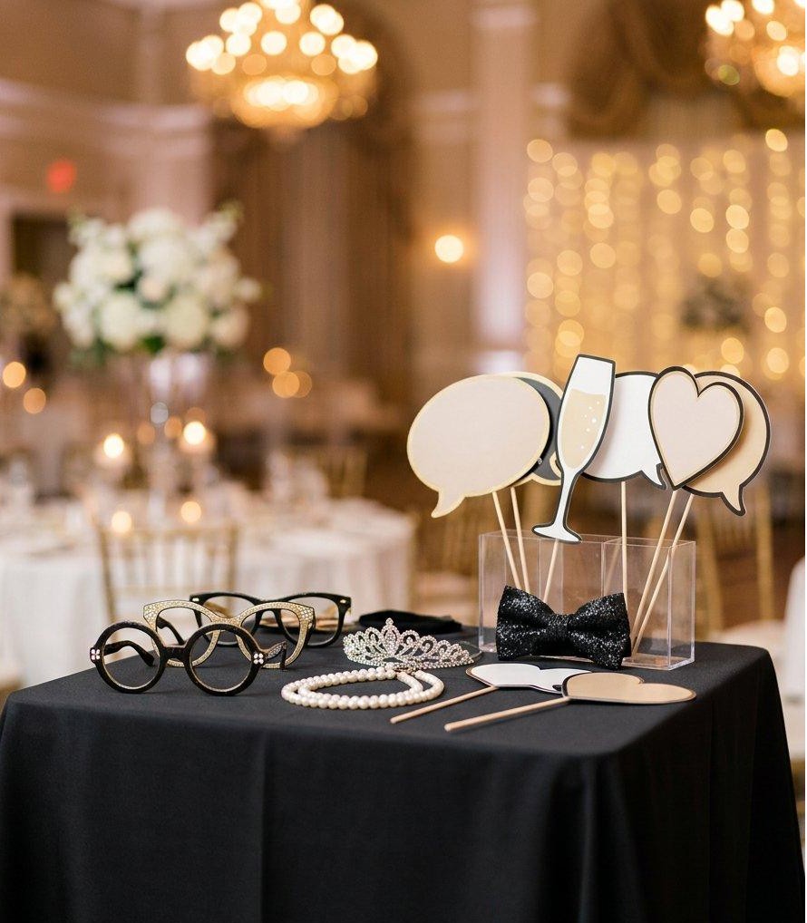
2) Metallic + neutral accessories (the “black tie friendly” category)
If your wedding has any kind of elevated feel (classic, modern, romantic, black tie, garden luxe), neutrals and metallics are your best friend.
Think:
gold-toned crowns or headbands
champagne-toned glasses
pearl or satin bows
sleek black sunglasses
These add energy without screaming for attention.
3) “Classic props” - but upgraded
Yes, guests still love the classics (glasses, lips, mustaches). The difference between classy and cheesy is quality.
Skip flimsy cardstock. Choose props that are:
sturdy
cleanly designed
neutral or wedding-coordinated
4) Handheld frames (simple black/white, optional personalization)
Frames are one of the easiest ways to make guests pose in a way that looks intentional.
Bonus: if you add a subtle personalization (initials or wedding date), it feels custom without overpowering the photo.
5) One “statement” item (keep it intentional)
This is where you can add personality without clutter.
Examples:
a single oversized “YAY”
a sleek “Mr / Mrs” sign
a champagne bottle prop (especially for celebration vibes)
Just don’t do five statement items. One is plenty.
What to skip (if you want your booth to look luxury)
These are the usual suspects that make wedding photo booth photos feel cheap:
1) Anything neon-colored or cartoonish
Bright foam props and loud colors tend to clash with wedding palettes and look dated fast.
2) Cheap wigs (unless your wedding is explicitly themed)
Wig stations can be fun, but they usually turn your gallery into a completely different event.
If your vibe is luxury, skip it.
3) Overly long phrases
If guests have to read the prop, it’s too much.
Short phrases photograph better and keep the line moving.
4) Too many props on the table
More props doesn’t mean more fun.
Too many props means:
guests take longer to choose
the booth line gets longer
the table looks messy in the background
A curated set always wins.
2026 wedding trend note: “clean + curated” beats “more”
A lot of what’s trending right now is intentional design:
clean signage
minimal print layouts
elevated props
experiences that feel premium (not cluttered)
In other words: your photo booth should match the level of the rest of your wedding.
How to match props to your wedding style (fast)
Use this quick pairing:
Modern / black tie
black + gold props
sleek sunglasses
minimal word signs
metallic accents
Romantic / garden
soft neutrals
pearl bows
“forever” / “love” signage
delicate frames
Fun + high-energy (but still classy)
one or two sassy signs
stylish glasses
one statement prop
keep the palette tight
FAQ: the questions couples ask right before they book
Do we even need props for a wedding photo booth?
Not always. If you want a clean editorial look, you can go minimal.
But a small, curated prop set helps guests loosen up quickly—especially early in the night.
How many props should we have for 100–150 guests?
Enough for variety, not enough for chaos.
A solid range is 20–35 total pieces, depending on the mix (signs + accessories + frames). The goal is to keep the table looking curated and easy to choose from.
What’s the best way to keep props from getting messy?
A simple layout helps:
a few small containers (for glasses/bows)
a clean sign stand
a “return props here” spot
And if you have an attendant, they can keep things tidy and flowing.
Want a classy prop setup without overthinking it?
If you’re getting married in Los Angeles (or within 30 miles) and you want a photo booth that feels luxury from lighting to prints to the overall look, I can help you choose a prop mix that matches your vibe.
To get a quote, send:
your wedding date
venue location
estimated guest count
your style (modern, romantic, black tie, garden, etc.)
Request a quote from The Shutter Soirée and I’ll recommend the best setup for your wedding.